Being an old broad, I regularly pat myself on the back for my nominal computer skills–every digital signature is a victory over adversity. My husband, Aaron, is similarly hanging on by his fingertips in our significantly virtual workplace. His drawing and design skills are entirely a relic of the lost analog age, developed out of his childhood love of comic books–a great many read by flashlight under the covers. As a young man he assembled punk zine pages by pasting photostat elements onto blueline boards with a hot wax gun. He says he can still recover the sense memory of the smell.
As always, Aaron drafted the floor plan for the Buckhead store with a pencil and a ruler on a sheet of grid paper, and took it to an architectural firm to be rendered & annotated in CAD files suitable for review by all the city agencies who need to sign off on new renovation. A young engineer looked at the plan curiously and asked us, “What program did you make this in?” The drawing of me above with mannequin was originally done (sans mask) in ink on paper, then scanned and colored digitally by our longtime graphic designer, Becca, who, working from my husband’s rough pencil sketches, has created nearly all of our ad campaigns and printed collateral: the Manifesto, Owner’s Manual, hang tags, billboards, client cards, direct mailers, etc.
I suppose what I’m getting at is an idea that, for better or worse, our generational bias toward the physical world is part of the DNA of the company, permeating not just the fitting room experience but the whole brand presentation.
Below are some images from our archives of past and present collaborations in pencil, paper, and pixel.

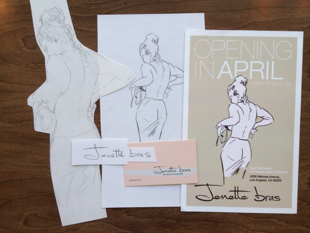
Here’s our very first flyer, from 2009, when we opened our first shop in east Hollywood. I posed for the drawing, which we still use because it is still TOTALLY ACCURATE.

For a minute we had a mascot named Lois, hapless but irrepressible, promoting our Gal Friday events in Pasadena.

Ok, this one is all digital on our end (though of course, if we go back to the original Joseph Caroff design, we might be entirely shocked by just how hand-made those deteriorating stencil letters originally were). Opening on the West side was our big leap forward as a company. We thought about this graphic for our announcement, but went with a less referential idea.

Below is just some fragment of work product for some store opening, featuring our ubiquitous bra silhouettes. The bra design, which can be seen on our bags, our Owners Manuals, and painted on walls both inside and out of various shops, was created analog/ digital: my husband spread bras out on the floor, photographed them, printed out the photo, traced the bra shapes, scanned the tracing and sent the scan to our designer, Becca, who cleaned up the file and filled in the shapes with flat color in photoshop.

Here’s a mid-process example of design communication between primitive (Aaron) and modern (Becca) man.


Here’s a current billboard, designed by Aaron & Becca, on view on Atlanta’s Roswell Road. Billboards are our new marketing passion: look for one in Pasadena coming soon.

